You can create more complex Graphs if you would like to compare multiple values (side-by-side) or group values (stacked).
Here are some examples of more complex graphing techniques using the Graphing Tools available in FAST.
First of all, be sure to start by creating a basic graph to get familiar with all the options and tools available.
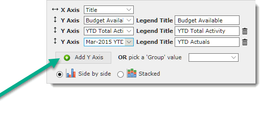
Once your Basic Graph is in place, you can begin to add additional detail such as multiple Y-Values. This allows you to create Comparative Graphs where you can view detail side by side. In this example, I am reviewing Financial data and would like to see my Budget Available, my YTD Total Activity and my YTD Actuals in side by side columns.
To add any number of additional Y-Values, simply click Add Y Axis:
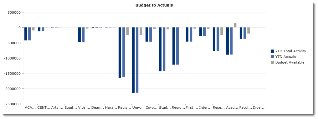
The result is a more complex graph that can be used on my Dashboard:
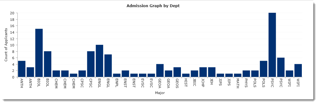
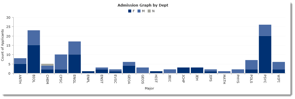
I could also choose to create a graph where I use a Group Value to re-distribute the data from my Pinned Report. To do this, create a Basic Graph.
Here is my example of a Basic Graph without any additional Grouping:
Once you have the basics, Locate the section where you can pick a "Group Value" and select an option from the drop-down menu. I am going to add this to my graph.
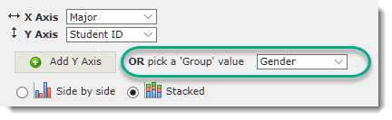
Finally, you need to select whether you would like to display this grouping as a Side by Side or a Stacked Graph. I am going to choose Stacked. Here is the result of my selection:
Don't forget to save your work before leaving the page! To save your Graph, you need to save the Pinned Report (which represents the underlying data) and the Graph - this is done in one easy step!
Next you're ready to begin adding Graphs to your Dashboards.
![]()