Once you have created a report, one of the options you have is to graph it, and make it accessible on your Dashboard. Let's start with a basic example.
An important rule when it comes to graphing is that at least one of your variables (called the Y-Axis) must be a numeric field. For this reason, your report (or dataset) may need a bit of work before it's ready to be graphed.
If this is the case, check out the section on how to use Advanced Options to prep your data for Graphing.
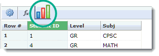
When you have a data set that is ready to begin graphing, click on the Graph icon on the toolbar ribbon:
The Graph Options worksheet will open just above the datagrid, so you can still see both panes open at the same time as you begin to build your graph.
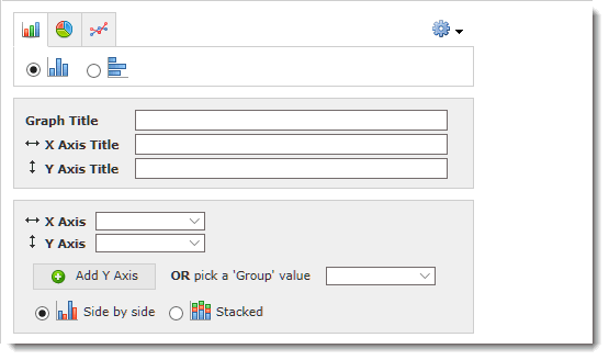
Graph Type: You can choose from Bar Chart, Pie Chart (which includes Donut Graphs) or Line Chart
Orientation: For Bar Charts, you can also choose whether the graph should display as a standard Vertical Bar Chart or as a Horizontal Bar Chart
Graph Title: Include a meaningful title for the Graph (please note that the Pinned Report title will be separate and is saved at a later step; these do not have to be the same, but can be)
X-Axis Title: Include a title for your X-Axis
Y-Axis Title: Include a title for your Y-Axis (more than one if applicable)
X-Axis field selection: In this drop-down, choose which field will contain the X-Axis data
Y-Axis field selection: In this drop-down, choose which field will contain the Y-Axis data (note: only numeric fields will appear here)
You may also select the button to add an additional Y-Axis if necessary; this will automatically open up another line.
Or, you may also choose a value to "Group" by, thus creating a new style of graph. For Grouping, choose between the Side by Side or the Stacked options.
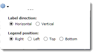
Using the gear button, you can also change the Label Direction (Horizontal or Vertical) and the Legend Position (Right, Left, Top, Bottom):
As you make changes to the Graph Options, you will notice your graph begin to take shape. You can make edits on the fly to see how it might look using a different style of graph, a different orientation or even changing your Label Direction or Legend Position.
Here is the result of our work, creating a basic, Horizontal, Stacked Bar Chart:
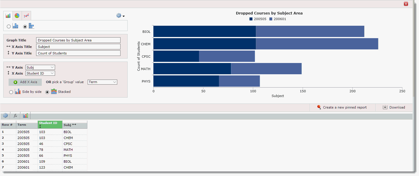
If you would like to download your graph, click the Download button.
If you are happy with the results and are ready to save your Graph, you can do so by clicking Create a new Pinned Report. Now this may seem odd but remember, to create and save a Graph, you must also create and save a Pinned Report. Every Graph is also a Pinned Report because you are simply graphing a subset of data based on your original report. To do this, in one simple step, click Create a New Pinned Report, a Save As dialogue box will open. We are now being prompted to save the underlying report, while also saving the graph to be available for use on a Dashboard.
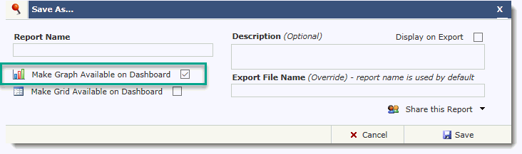
Just like saving standard Pinned Reports, you will be prompted to include the following:
Report Name: This can be the same title as your Graph or it can be a unique title
Description (optional): Description for the Pinned Report
Display on Export (optional): If you would like the Report description to be included when the report is exported
Make Graph available on Dashboard: You will notice that this check box is pre-selected once your graph is built
Make Grid available on Dashboard: You may also choose to select this check box if you would like your datagrid to be saved and made available as a Grid on your Dashboard
Export File Name (optional): Use this field only if you would like the file export name to be something other than the Pinned Report Name
Share this Report: If you wish to share this report, or allow other user groups on campus to access the graph, you can choose to enable one or more of the Sharing Options (this is a role-based function and not all users will be able to share their reports or graphs). If you do not enable any Sharing options, this report (and the graph) will be private.
Once you're ready, click Save to complete.
Now you're ready to move on:
Graphing Styles: Bar Charts, Line Charts, Pie Charts and Donuts
![]()